UX/ UI and Product Designer

Information systems
What you will see on this project
Problem definition
The Industrial University of Santander is one of the most recognized universities in academic programs in the industrial, health, political, social, and scientific sectors of eastern Colombia.
The information systems project involves the redesign and integration of various computer systems, including the payroll system of the Industrial University of Santander. Focused on user experience, the goal is to enhance system visibility to enable optimal task execution and reduce the learning curve.
My role
My role as a UX/UI designer involved analyzing the flow of activities performed on the current platform, researching user needs, patterns, and preferences, as well as identifying the minimum necessary elements for payroll tasks. This included creating wireframes and UI designs, and conducting usability testing with users. All of this was done in collaboration with an excellent team, utilizing the Scrum methodology.
Participants
-
Systems engineers
-
Industrial designers
-
Accountants
-
Payroll system users
-
Scrum roles
Companies and institutions


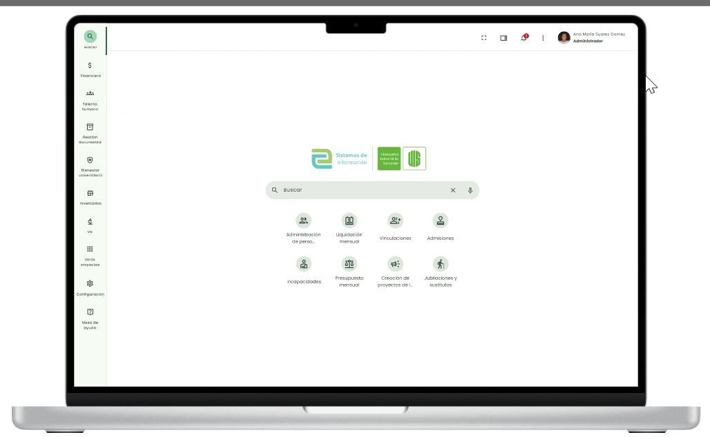
User interface
Navigation and search
During this project, one of the challenges to improve was the system's navigation due to the following difficulties:
-
Limited visibility
-
Cascade-style menu with menus extending up to 7 or more levels deep
-
The system lacked the ability to switch roles without exiting the interface
-
Lack of understanding of the user's journey within the system
To address these problems, we implemented the following solutions:
-
Developed a system that allows changing roles at any time during navigation
-
Introduced a section displaying the user's history
-
Implemented breadcrumb navigation
-
Incorporated a side navigation menu for easier access to projects
-
Integrated a cross-platform search system.

Access to history, favorites and extensions

change and role manager

Side navigation with tooltip

Dashboard


To define the content of the dashboard, two main aspects were taken into account:
-
Customization of the dashboard according to the user type and their frequent activities.
-
User workspace.
We conducted an inspection to understand how users use the calendar to record key dates and distribute documents related to the payroll process. We identified three categories of documents: new, in progress, and pending.
With this information, we defined the following components:
-
Pending Requests: Visualization of physical documents displaying the user's daily activities.
-
Payroll Progress by Month: Visual representation of the payroll month in a timeline format for the user to track their progress.
-
Calendar: Displays the user's daily activities and syncs with the company's email.


Design elements


In this project, we used the Material Design Builder to create a coherent and attractive color palette. We also implemented a careful selection of the typography library to enhance readability and design aesthetics. These elements were combined to create a visually pleasing and functional experience for end users.


Analysis of the current system
-
User navigation is keyboard-dependent, limiting accessibility.
-
Minimal feedback is provided for executed actions, hindering user understanding.
-
The "waterfall" navigation method overlaps selections, reducing visibility.
-
Minimal error tolerance exists due to the "waterfall" navigation.
-
Many input fields are not visible, impacting interaction.
-
The lack of feedback for incorrect information entry makes error correction challenging.

User analysis
An analysis of the users of the payroll system was conducted using the "person" tool, which revealed four distinct roles.

Information Architecture
During the platform redesign, we applied the Cardsorting technique to organize the labels according to user preferences, which facilitated the creation of intuitive and user-friendly navigation tailored to their specific needs. As a result, we developed a navigation structure focused on projects encompassing various systems and processes. Additionally, we implemented a submenu with two levels of depth to enhance access and findability of activities based on the user's role.

Prototyping and iteration


In this project, prototypes ranging from paper sketches to low, medium, or high-fidelity wireframes were developed according to the needs of each sprint. Each of these prototypes was shared with the corresponding team and evaluated with users, adjusting them based on test results. The aim was to create a high-quality product that meets users' needs.
Wireframe testing


The images illustrate an example of iteration with users. Stories were designed for entering payroll updates, which were provided to participants along with the necessary documents to complete the task and sticky notes for comments. During the testing scenario, the flow of interconnected screens was displayed on the wall. After each iteration, notes were taken and corrections were made as needed.
Usability test
A digital and interactive prototype evaluation was conducted with user leaders, assessing the efficiency, effectiveness, and satisfaction of the proposed interface for the payroll system. Case studies of specific payroll updates were utilized. The test took place in a room allowing observation of the user from another room. Both the computer screen and the user's gestures were recorded during the activity using an external camera.
This approach also helped identify moments of frustration during the activity.
Participant images are not shown due to privacy concerns.
Performance of the test
Description of the activities
The activity consists of the entry of a payroll update corresponding to each digital prototype according to each role.
Role:
-
Carolina B, payroll officer who will enter payroll updates of: (overtime, incapacities, maternity leave, paternity leave, unpaid leave, and customs).
-
Juan Carlos, a self-service user, requests the new (medical appointment leave, domestic calamity, sabbatical year, and bereavement leave).
Development of the activity
Each participant will be given the following: case, task, and evaluation forms.
1. Contextualization of the general project and activities to be carried out by the evaluators 5 min.
2. Placement of the Begaze glasses on the participant and their respective calibration: 5 min.
3. The user must carefully read the format of the task to be performed and execute it using the prototype, 10 tasks: 45 min.
4. Once all the tasks have been completed, the user must fill out the evaluation form. 5 min
Usability metrics
Efficiency:
-
Time to complete a task (TCT)
-
Productive time (TP)
Effectiveness:
-
Percentage of tasks completed on the first attempt (TCPI).
-
Time used to complete a task for the first time.
-
Number of errors: the following items are considered to be errors
-
Incorrect user
-
Incorrect password
-
Incorrect entry
-
number entered exceeds the maximum
-
entry of numbers in the text box
-
text input in the numeric box
Satisfaction: (evaluation format)
-
Difficulty level
-
liked or disliked
-
preference

Conclusions
Of the goals
-
This work was carried out hand in hand with users and developers, which led to excellent results with respect to the information to be provided.
-
An optimization in the visibility of the interface was evidenced, which also brought about an increase in user satisfaction, highlighting the feedback elements.
-
A decrease in the learning curve was evidenced since the interface used an intuitive language.
-
There was a specific case in the entry of payroll updates where it was observed that the average speed with which they executed the action decreased by 20%, this is due to the fact that a different flow of the task was proposed to the one already established by the current system, which caused them to pause to analyze the order of the information entries, however, satisfaction increased with respect to this activity.